
Teaching Color Theory Through Fun Painting Activities for Children
The world is a vibrant tapestry of colors, and understanding how those colors interact is fundamental not just for artists, but for comprehension of the world around us. Introducing color theory to children isn’t about creating miniature Monets; it's about fostering critical thinking, observation skills, and an appreciation for the visual world. Many parents underestimate the cognitive benefits of early exposure to artistic concepts. While foundational literacy and numeracy rightly take center stage, nurturing visual intelligence through color exploration lays a strong groundwork for problem-solving, design thinking, and even scientific understanding.
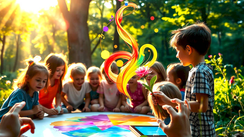
Early childhood is a particularly sensitive period for sensory development and learning. Children are naturally drawn to color, and capitalizing on this innate interest can unlock a powerful avenue for educational play. Rather than abstract lectures, color theory is best absorbed through hands-on experiences, making painting a perfect medium for exploration. By engaging children in playful painting activities designed to illustrate core principles, we can empower them with a foundational understanding of color that will benefit their artistic endeavors and broader cognitive skills.
This article will delve into practical and engaging ways to introduce the fascinating world of color theory to children through painting, providing parents and educators with the tools and ideas to make learning both fun and effective. We’ll move beyond simply naming colors to explore how they relate to each other, how they can be mixed, and how they evoke different emotions and sensations—all through the joy of painting.
- Laying the Foundation: Primary Colors and Color Mixing
- Introducing Secondary Colors and the Color Wheel
- Complementary Colors and Contrast: Making Colors Pop
- Exploring Color Temperature: Warm vs. Cool Tones
- Value and Shading: Adding Depth and Dimension
- Expanding the Palette: Tertiary Colors and Beyond
- Conclusion: Nurturing a Lifelong Appreciation for Color
Laying the Foundation: Primary Colors and Color Mixing
The cornerstone of color theory lies in understanding primary colors: red, yellow, and blue. These aren’t just names; they’re the building blocks from which all other colors are derived. Beginnning with this concept is crucial as it establishes an understanding of how color is created, rather than simply observed. A simple starting point is to provide children with only these three colors and encourage them to experiment. Emphasize that no matter how much they mix them, they can't create these primaries – they always need to start with red, yellow or blue.
To build this core understanding, a “Color Mixing Discovery” activity is ideal. Provide small portions of red, yellow, and blue paint, along with brushes and paper. Encourage children to mix two colors at a time, recording (or verbally describing) their observations. For example, what happens when red and yellow combine? What about blue and yellow? What about red and blue? This isn't about achieving perfect shades, but about recognizing the predictable outcomes of color combinations. Guide their observations by asking questions such as, “What does this new color remind you of?” or “Is it lighter or darker than the colors you mixed?”
Furthermore, highlighting the limited nature of primary colors reinforces the entire concept. Explain that even professional artists rely on a palette of primaries (plus white) to achieve a vast range of hues. This demystifies the artistic process and underscores the importance of mastery of these foundational colors. It’s also valuable to introduce the term "hue" – the pure form of a color – so children begin to differentiate between a "red hue" and a mixed shade of orange.
Introducing Secondary Colors and the Color Wheel
Once children have grasped the concept of primary color mixing, it’s time to formally introduce secondary colors: orange, green, and purple. These colors are created by mixing two primary colors together. Connecting this back to the previous activity provides immediate reinforcement of the lesson. When children successfully create these colors themselves, it seals their understanding in a tactile and intuitive way. Reinforce this discovery with a visual aid - the color wheel.
The color wheel isn’t just a pretty chart; it's a map of color relationships. Introduce it slowly, starting with just the primary and secondary colors. Explain that colors opposite each other on the wheel are “complementary colors,” meaning they create strong contrast and visual excitement (more on this in the next section). A fun activity is to create a child-sized color wheel. Using paint, children can fill in a circular template with the primary and secondary colors in their correct positions, effectively solidifying their understanding of the color-mixing process and the wheel’s visual representation.
Instead of solely presenting the color wheel as a finished product, encourage children to build it, and then decorate it. This reinforces the learning process as they consciously place “red” and “yellow” to create “orange”, and then place “orange” on the wheel. This also gives a sense of accomplishment and ownership over the concept. It's important to reiterate that the color wheel is a tool for understanding color relationships, and isn't simply something to memorize.
Complementary Colors and Contrast: Making Colors Pop
Understanding complementary colors – those opposite each other on the color wheel (red & green, yellow & purple, blue & orange) – is key to creating visually dynamic paintings. These color pairings create the strongest contrast, making each color appear brighter and more vibrant. Explain to children that looking at a patch of red after looking at a patch of green makes the red seem more intense, and vice versa.
A powerful way to demonstrate this is through "Afterimage Art." Have children stare intensely at a square of one color (e.g., red) for about 30 seconds, then quickly look at a white surface. They should see a ghostly afterimage of the complementary color (green). This provides a first-hand experience of how colors influence our perception. To translate this to painting, introduce a project involving complementary color schemes. A simple example is painting a landscape with predominantly blue and orange hues, or creating a portrait using red and green tones.
An added dimension to this activity is asking children to describe how the colors make them feel. Does the red and green combination feel energetic? Does the blue and orange feel calming? This ties color theory to emotional expression, highlighting its subjective nature. It’s vital to acknowledge that while complementary colors create strong contrast, it doesn’t automatically equate to “good” art – it's a choice an artist makes to achieve a specific effect.
Exploring Color Temperature: Warm vs. Cool Tones
Colors aren’t just about hue; they also have temperature. Warm colors (reds, oranges, yellows) are associated with energy, excitement, and warmth, while cool colors (blues, greens, purples) evoke feelings of calmness, serenity, and coolness. Discussing this concept extends beyond simply recognizing colors to understanding their psychological impact. “How does a painting filled with reds and oranges make you feel? How about one filled with blues and greens?”
Painting activities can be designed around color temperature. For example, have children create two paintings of the same subject – one using predominantly warm colors and the other using predominantly cool colors. Ask them to compare the emotional impact of each painting. Another useful exercise is to create a gradient progressing from warm to cool colors. This visually demonstrates the transition and allows children to observe how colors subtly change in feeling and appearance.
Consider incorporating storytelling to reinforce the concept. “If you were painting a scene of a blazing summer day, would you use mostly warm or cool colors? What about a winter landscape?” This contextualizes color temperature and makes it more meaningful. It’s also beneficial to point out how artists intentionally use color temperature to create focal points within a painting – warm colors tend to advance visually, while cool colors recede.
Value and Shading: Adding Depth and Dimension
While hue and temperature are important, understanding value (the lightness or darkness of a color) is crucial for creating realistic and dynamic paintings. Explain that adding white to a color creates a “tint” (lighter value) and adding black creates a “shade” (darker value). Introduce the concept of a value scale - a gradient chart showing shades of one color, from pure hue to white and black.
A wonderful painting activity for exploring value is monochromatic painting – using only one color and its tints and shades. Have children choose a color and then create a painting using only variations of that color. This forces them to focus on value and shading to create depth and form, rather than relying on a wide range of hues. Encourage them to observe how light and shadow fall on objects and try to replicate those effects using different values of their chosen color.
Connecting this to real-world observation is helpful. "Look at an apple. Is the whole apple the same color? Where are the lightest areas? Where are the darkest?” This encourages children to actively observe the subtle variations in value that exist in the world around them. Explain that understanding value is essential for creating realistic shadows, highlights, and the illusion of three-dimensionality in paintings.
Expanding the Palette: Tertiary Colors and Beyond
Once a solid understanding of primary, secondary, and value is established, you can introduce tertiary colors – created by mixing a primary color with a neighboring secondary color (e.g., red-orange, yellow-green, blue-violet). Emphasize that these colors aren’t “less important” than the primaries or secondaries; they simply expand the range of possibilities.
Encourage children to experiment freely with mixing tertiary colors, reinforcing their understanding of color relationships. A “Color Exploration Journal” can be a valuable tool. Children can paint small squares of blended colors, labeling them with their component parts (e.g., “red + orange = red-orange”) and noting their observations. Beyond tertiary colors, briefly mention that artists can continue to blend and nuance colors infinitely, creating an endless spectrum of hues.
Finally, revisit the importance of white. Explain that white isn't just the absence of color; it’s a critical component of mixing tints and lightening hues. Discuss how artists historically used white pigments, such as chalk, to create vibrancy in their paintings. Remind children that color theory is a tool for expression and experimentation, and there are no "wrong" colors – only different choices.
Conclusion: Nurturing a Lifelong Appreciation for Color
Teaching color theory to children through painting isn’t about creating artists, although it might spark a passion for art. It’s about fostering a deeper understanding of the world around them, developing their critical thinking skills, and unlocking their creative potential. By grounding learning in hands-on experimentation and playful exploration, we can make complex concepts accessible and engaging for young minds. Remember that the goal isn't memorization of terms, but internalization of relationships.
The key takeaways from this exploration are the importance of starting with primaries, understanding the color wheel as a relational map, embracing the psychological impact of color temperature, and recognizing the role of value in creating depth and dimension. Encourage children to continue experimenting with color in their everyday lives – observing the colors in nature, noticing how colors are used in design, and most importantly, enjoying the process of creating their own colorful masterpieces. The activities described above are just starting points; adapt and modify them to suit a child’s individual interests and learning style, and let their creativity flourish.
Deja una respuesta